Client
METABEASTS
Time Frame
2 MONTHS
Services
CREATIVE DIRECTION
BRAND ASSETS
PACKAGING
SOCIAL & ADS
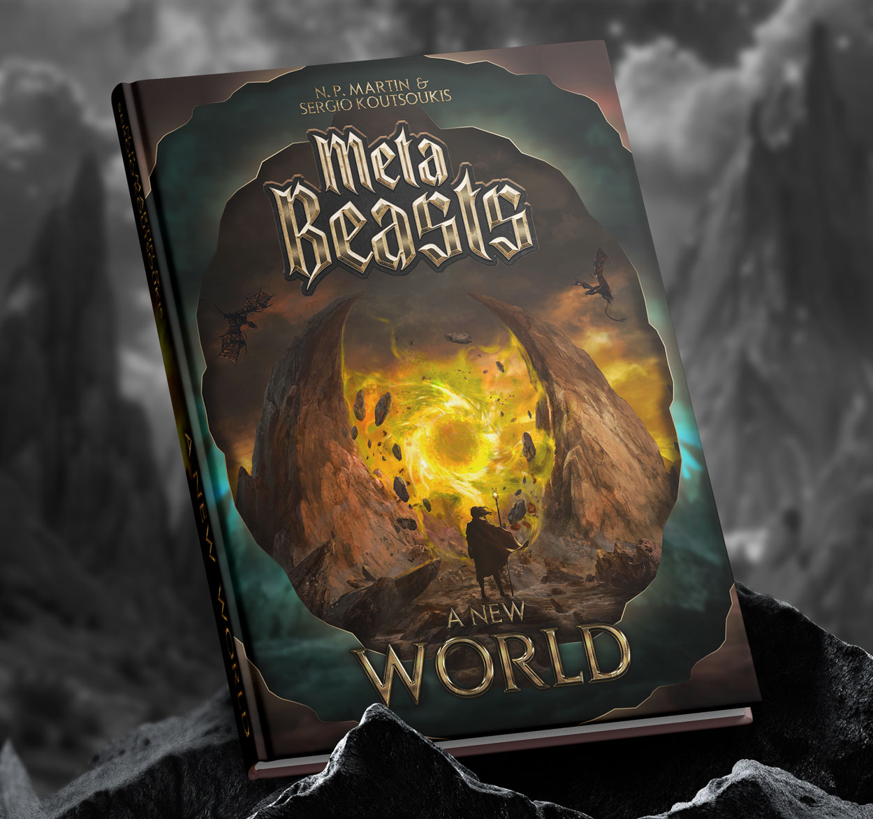
BOOK COVER
Deliverables
CARD BORDER
3 BANNERS
8 CARD PACKAGES
BOOK COVER
TRAILER
MetaBeasts wanted to create a dark fantasy trading card game for Millennials, using Web3 and NFTs.
Artquod Studio designed a distinctive card border, then filled the role of Creative Director and became part of the core team. We extended the project across banners, packaging, and a trailer, creating an immersive visual identity.
STUDY CASE
STUDY CASE
01/
THE PROJECT
MetaBeasts is a startup that was establishing a community at a rapid pace to create the next trading card game with a twist: they were going to be using the emerging Web3 technology to platform their game, in which every collectible card was its own NFT.
The project needed to be suitable for the nishe of young adults and adults, educated and tech-savvy individuals who were pouring into the NFT market, and was leveraging their nostalgia for the earlier Pokemon and other similar card games towards a new, mature, dark fantasy experience that could turn them a profit. Their successful first round of investing ensured the project had a high production quality across the board.

02/
THE SCOPE
They were in the process of commissioning artists from all over the world to digitally paint their card illustrations when they started internally exploring the mechanics of the game and realized the need for a new, Web3-focused card border. Sergio, MetaBeasts’s CEO, reached out to Artquod Studio, and together we started exploring the creative direction needed for the card border.
We quickly understood that, since the illustrations will always be different, the card border will play a major part in shaping the MetaBeasts brand and must be consistent with the rest of their assets.
Working closely with Sergio, early on we were asked to pivot to a Creative Director position and take control of the MetaBeasts brand, its visual assets, and touch-points with their audience, to ensure a consistent overview. We were involved in the decision-making as part of the core team from that point forward.
03/
THE PROCESS
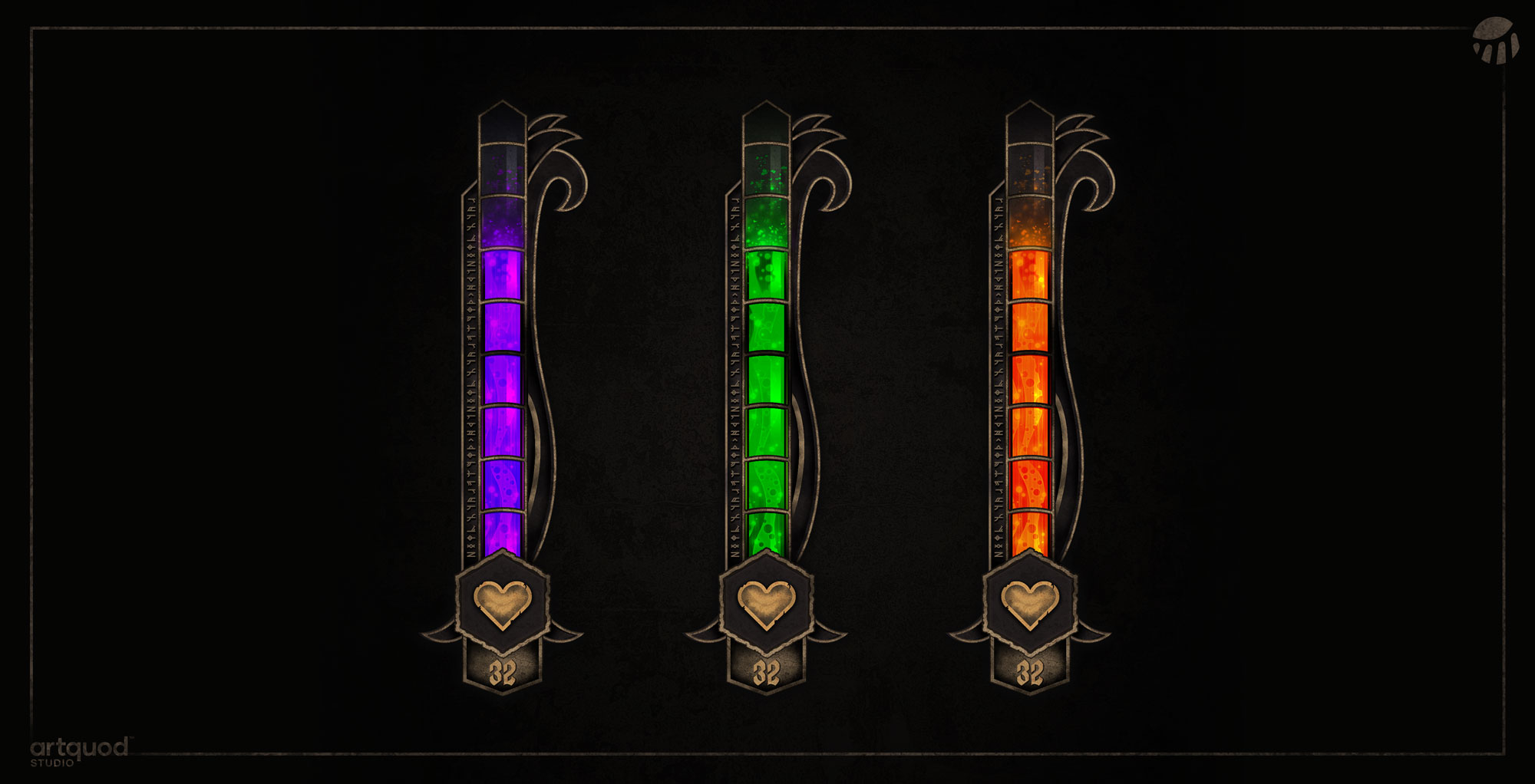
Since the assets were mainly targeted at Millennials with expendable income, we decided to go with a dark fantasy aesthetic and muted colors that better suited their age demographic. We first created the points bars as a starting point, which were instantly approved. Combining runic symbols with rugged dark metal, copper accents and sinister-looking versions of the colored points bar worked wonderfully in telling the story we intended.
Since the assets were mainly targeted at Millennials with expendable income, we decided to go with a dark fantasy aesthetic and muted colors that better suited their age demographic. We first created the points bars as a starting point, which were instantly approved. Combining runic symbols with rugged dark metal, copper accents and sinister-looking versions of the colored points bar worked wonderfully in telling the story we intended.
03/
THE PROCESS
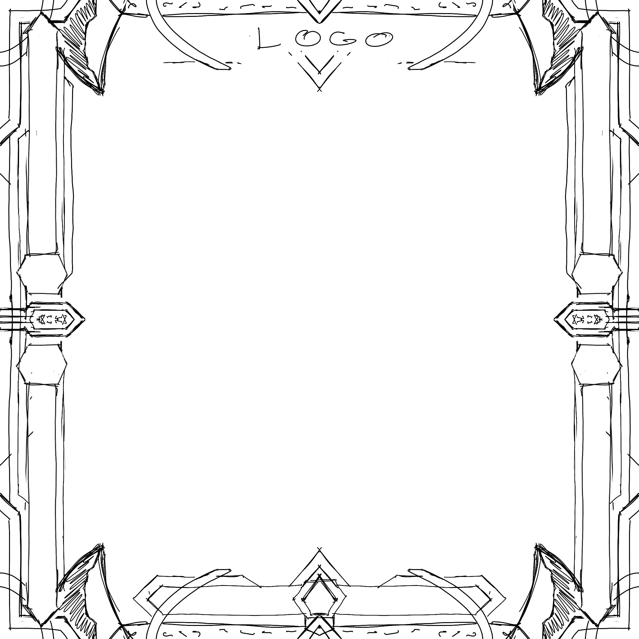
We moved on to sketching and creating card border iterations, aiming to make the border detailed and unique, without having it overshadow or take away from the card illustration. Sergio was tremendously helpful in explaining his vision and kept in constant contact.
He provided us with the first script for their origin book to help paint the project’s mood and had increasingly useful feedback as we presented him with successive border iterations.
Together, through 6 iterations we closed in on the artistic vision, finally locking in the design that communicated the spirit of the project’s world.
↑ FIRST POINTS BAR DESIGN
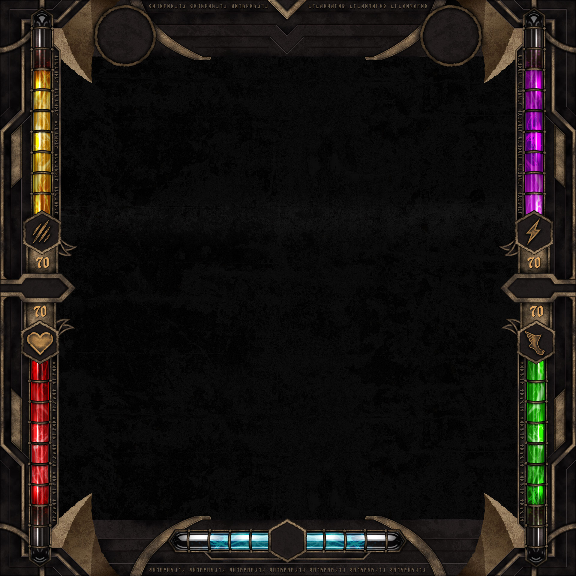


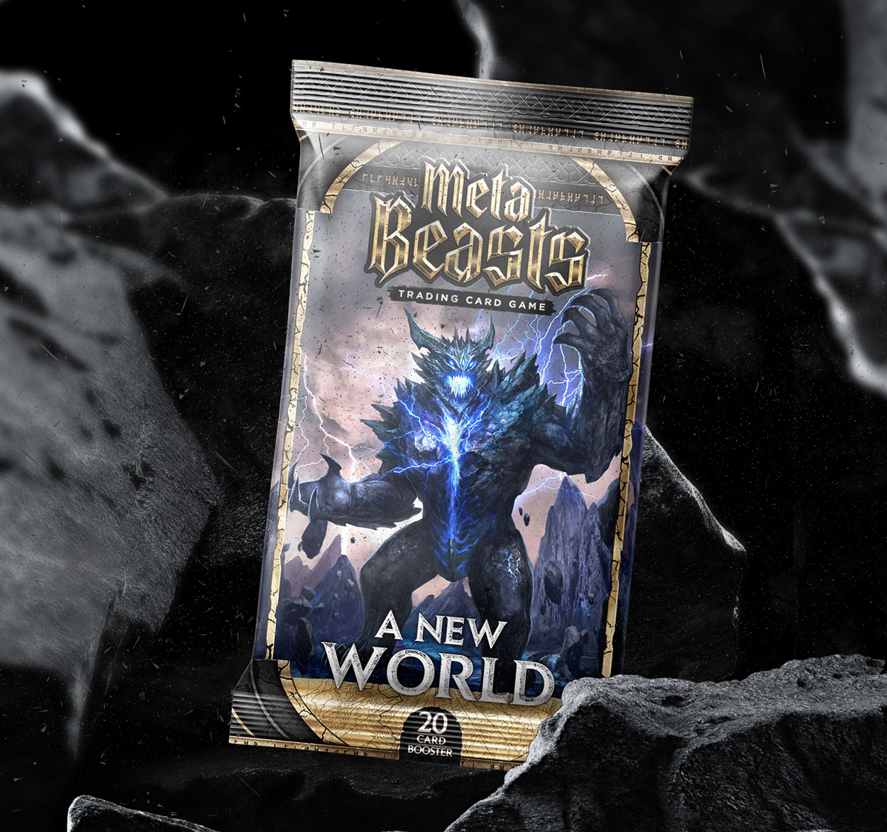
In the end we landed on a border version that is full of functionality, with visuals that start the process of world-building at first sight. The dark, cracked metal, and subtle medieval pattern is mixed with the arcane runes, rounded corners and curved lines from a more mystical aesthetic.
↑ THE 6 BORDER VERSIONS
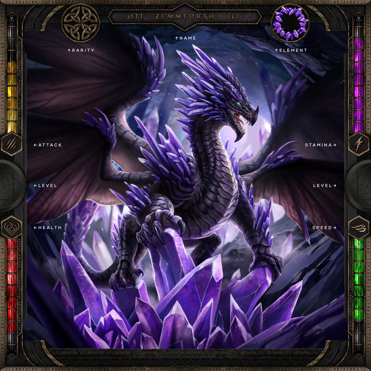
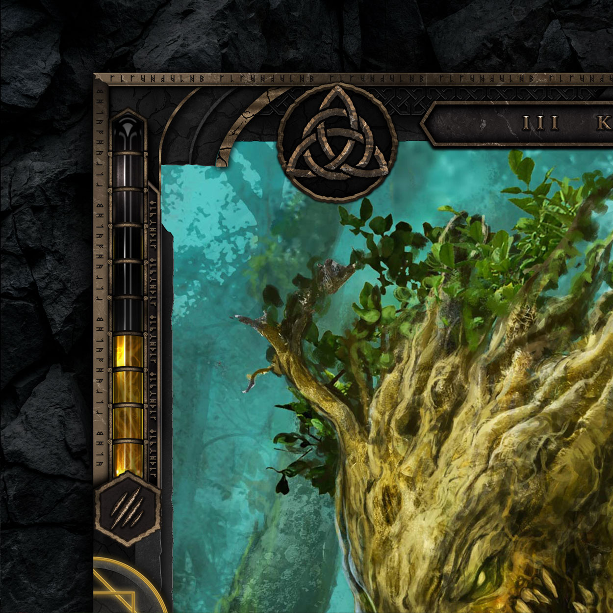
The border needed to have 4 ability points bars and showcase the level of the card, rarity, element type, and name. We’ve designed the rarity symbols circular to match the elemental illustrations, and presented both symmetrically on the top part, on each side of the name.
We wanted the level of the card to be more organic to the card border; instead of making it another icon, we’ve built two semicircles on the left and right side of the card with carved shapes that were filled progressively based on the level of the card and looked like a magic circle at the top level.
↑ THE FINAL BORDER
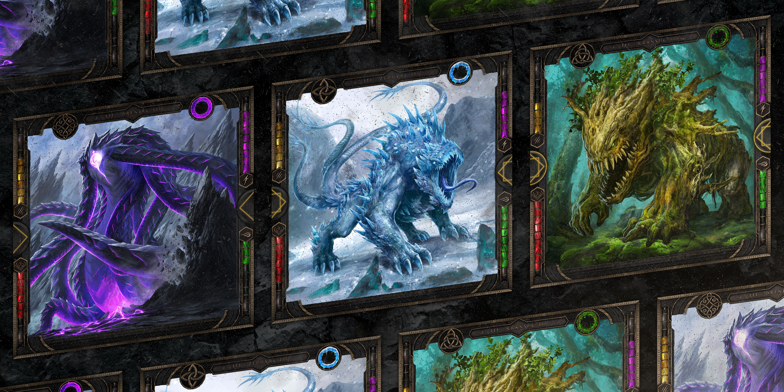
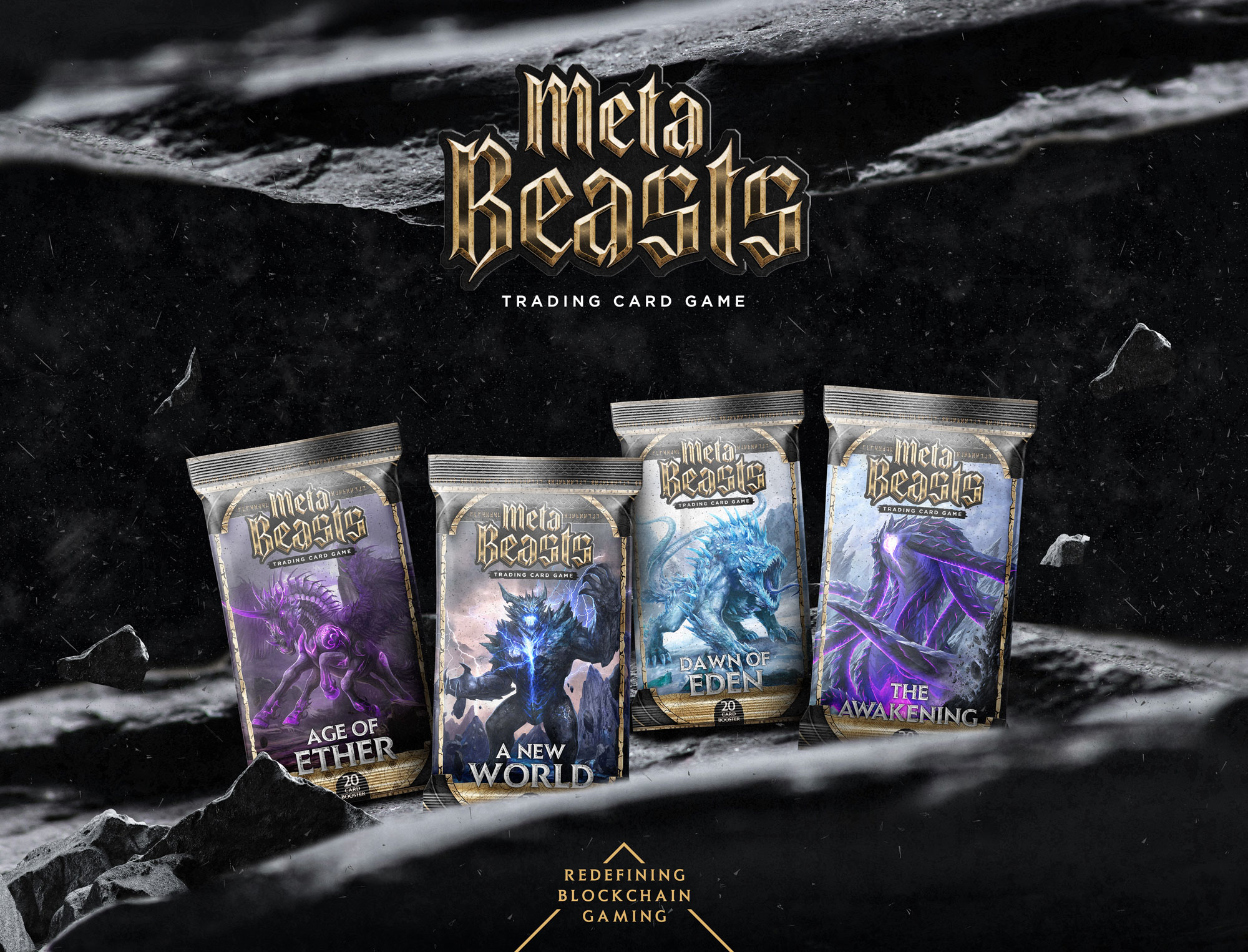
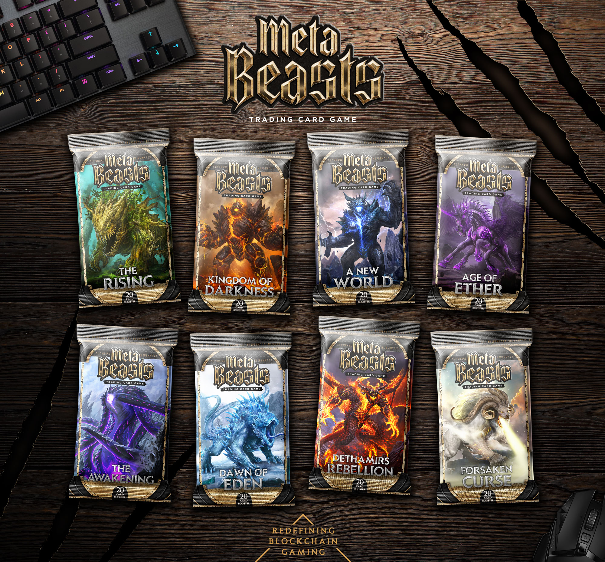
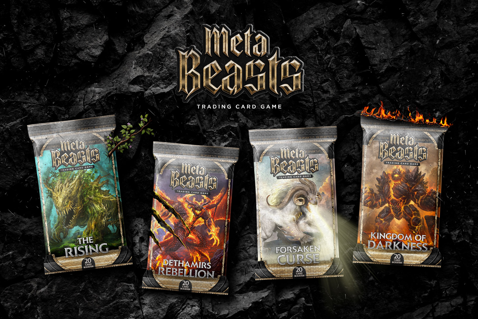
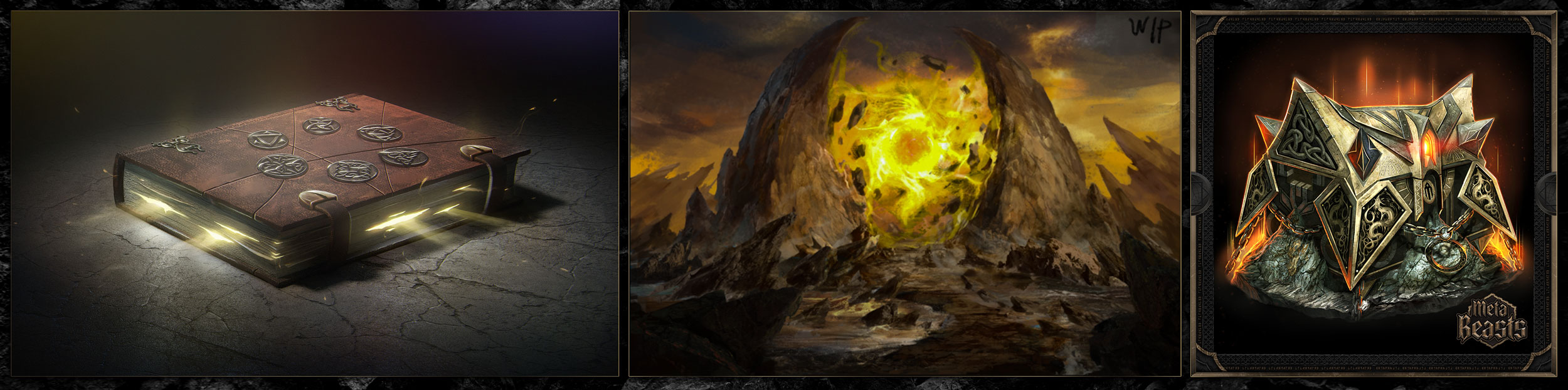
Once the border was finalized and tested with varied cards, we created ‘card loading’ animation, a couple of banners, a book cover, and card package designs for both the Web3 and the future physical versions.
We kept a consistent design throughout all of these assets to firmly flesh out the brand’s positioning.
↑ CARD LOADING ANIMATION
04/
THE CHALLENGE
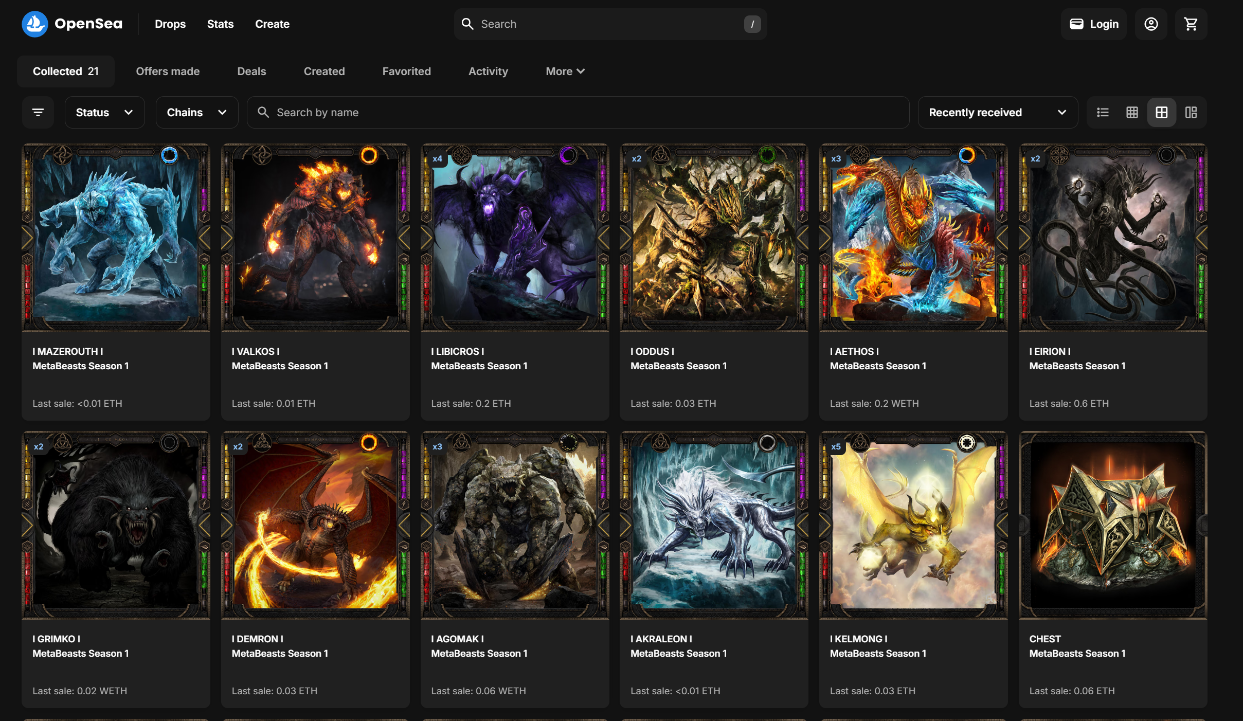
With the hyped community, excitedly awaiting the project’s launch on the OpenSea NFT platform, Sergio felt like the launch deserved to be preceded by an official trailer.
At the time we hadn’t offered motion graphics services and had no video content creation under our belt; still, Sergio had no hesitations and insisted we be the ones to create it. Even though we knew designing a trailer for the first time would be a challenge, we fell in love with the project and were confident enough in our skills to accept.
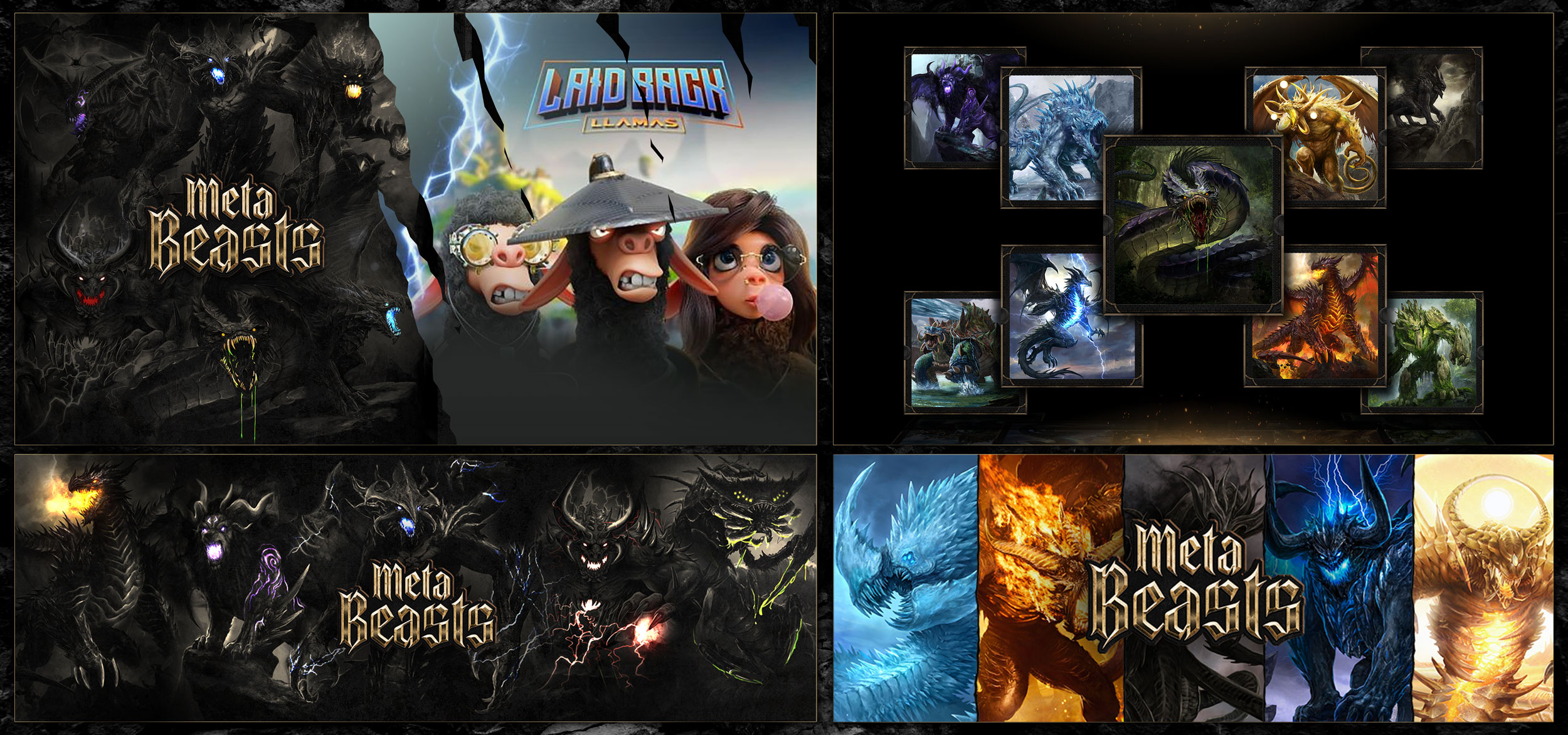
↑ ALL AVAILABLE ASSETS
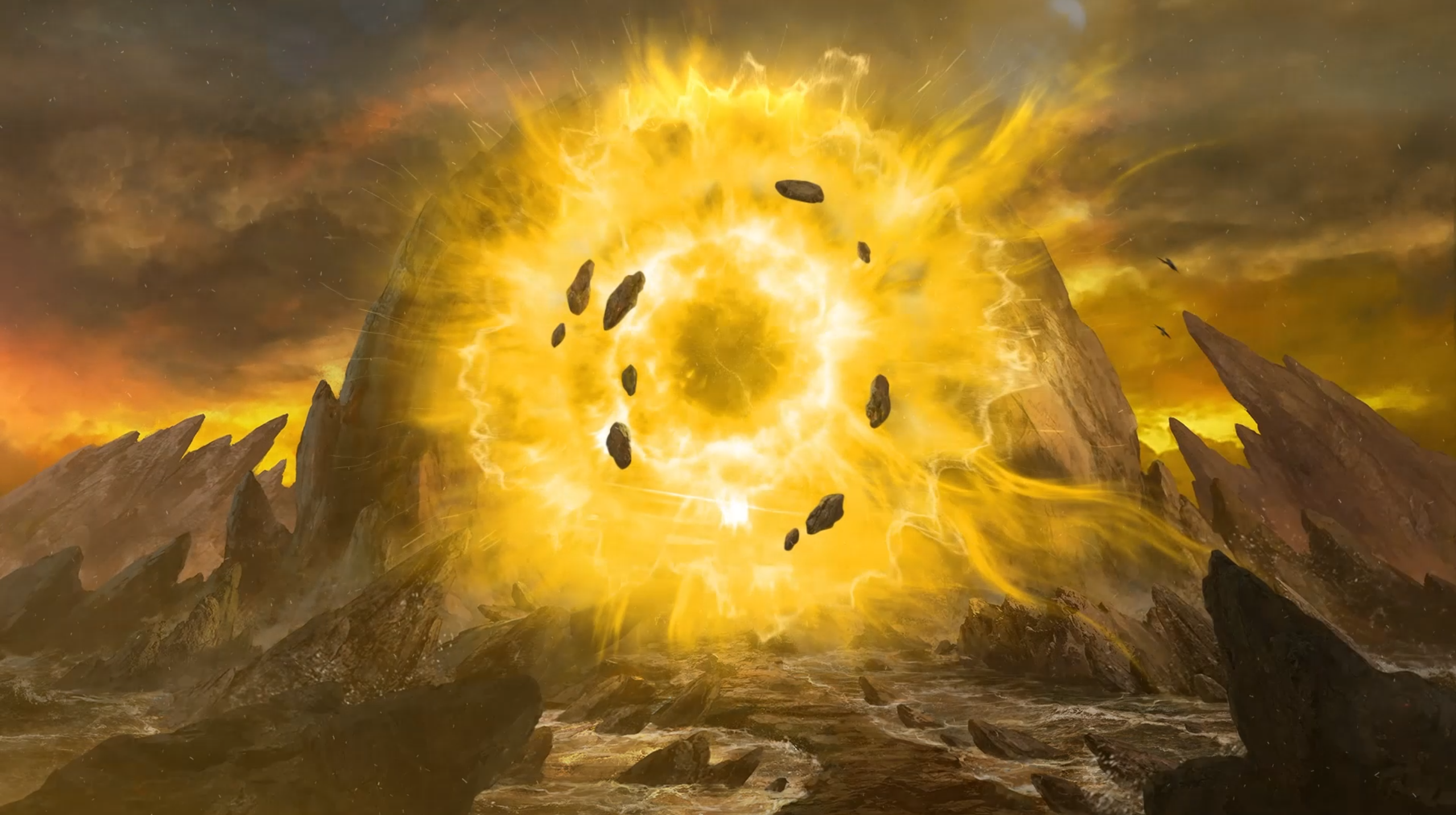
After checking out the very limited amount of existing assets that could be used for this, we created a storyboard sketch that utilized them, which was approved right away. We then moved on to production.
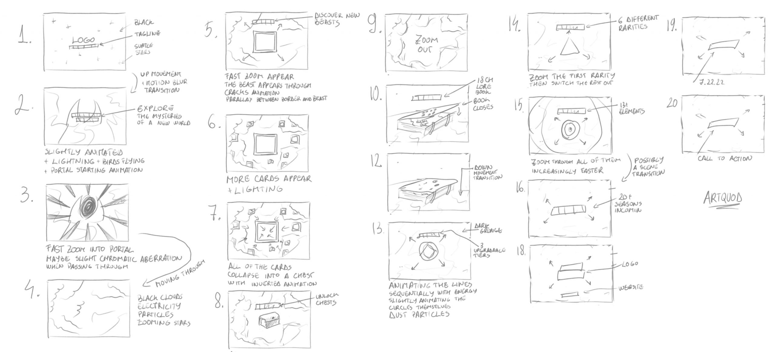
↑ TRAILER STORYBOARD
With this trailer, we wanted to give the audience a taste of the world that they were about to step into, while needing to present the scale and mechanics of the project and create excitement for the launch.
05/
THE ROLLOUT
After presenting the trailer along with periodic teasers on all social media platforms, the launch was so successfully received that the core team immediately started the work for MetaBeasts Season 2, an afferent physical trading cards game, an online trading cards game, along with a second round of investment.
During this project, the audience was targeted through the voice and tone of the project, along with all visual elements, meant to enhance the nostalgia of trading card games and recreate the same feeling of excitement and wonder in a dark fantasy setting.
Everything during the development process was created to appeal to the age demographic and interests of Millennials who have played trading card games in their childhood, have a larger budget, and would be open to mixing their adult Crypto interests with their entertainment and financial interests – since cards had a variable value and could become profitable.
”I had the pleasure of working with Cassian across multiple projects and I couldn't be happier with the results. His creativity, attention to detail, and ability to translate my vision into stunning designs has always amazed me. Whether it was building out landing pages, designing applications or creating cinematic trailers, he consistently delivered exceptional work. I highly recommend Cassian to anyone looking to take their design to the next level!
Sergio KoutsoukisMetaBeasts CEO